Context
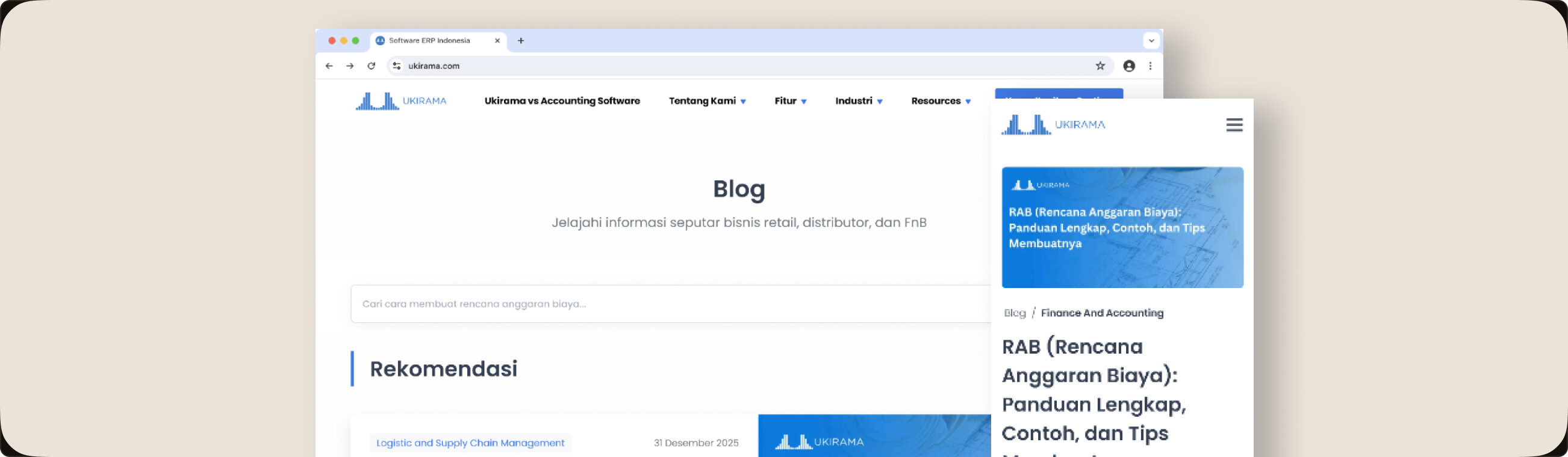
Ukirama is a Jakarta-based ERP software that helps businesses manage their operations more efficiently. I worked as one of the in-house UI/UX designers on Ukirama's public-facing site, including the blog, which plays a key role in attracting and educating potential clients.
Problem
What started as a simple place to store articles gradually became something much bigger. As content and categories grew, the old blog design couldn't keep up, making it hard for users to find what they needed and harder for Ukirama to showcase the depth of their content.
Research and Approach
To understand how users were interacting with the blog, our team used Microsoft Clarity, tracking heatmaps and session recordings to observe real behaviour. Two patterns stood out: users were losing track of where they were reading articles, leading to drop-offs, and they were struggling to find the specific content they were looking for. These insights shaped the direction for the revamp, improving reading continuity and making content easier to discover.
Decision
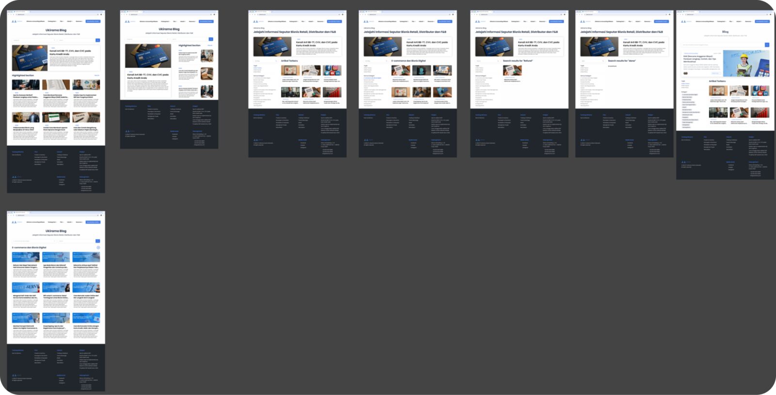
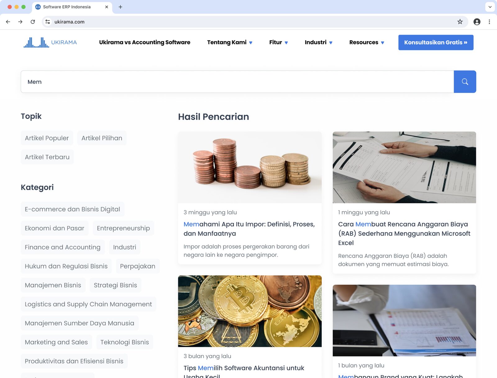
Working with the product team, we agreed the redesign needed to solve two problems: users losing track of where they were while reading, and users struggling to find relevant content. On the index page, I designed a content hierarchy with category filters so users could narrow down by topic without scrolling through everything, and redesigned article cards to surface title, category, and reading time upfront. On the article page, I focused on reading continuity: a sticky progress indicator so users always knew where they were, and related articles surfaced at natural stopping points rather than just the bottom of the page.
Outcome
The redesign shipped with structural changes on both the index and article pages, directly addressing the two problems Clarity surfaced: content discoverability and reading continuity. I don't have post-launch analytics to quantify the impact, as my access to Clarity ended when my time on the project concluded, but the design decisions were traceable back to specific, observed user behavior rather than assumptions.
What I Can't Show
Beyond the blog, I spent 3 years at Ukirama designing features and maintaining UI consistency across their ERP system. This work covers internal modules used by businesses across Indonesia, Singapore, Australia, and the Philippines. Due to company policy, these designs aren't publicly shareable, but I'm happy to walk through my process and decisions in a conversation.